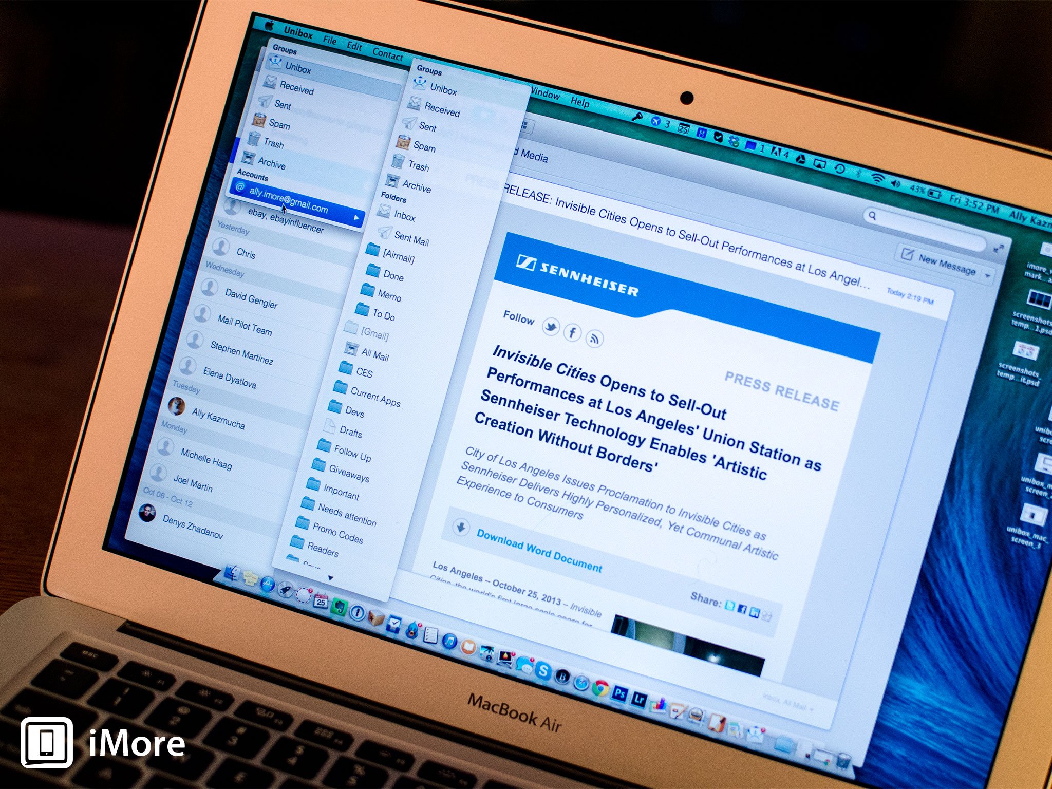
Unibox for Mac is a new and unique alternative email client for Mac. Most of us are used to using emails as an inbox system that works in order of when we received things. Unibox aims to change that by making email about the people we interact with more than just the strings of messages attached to them.
Upon launching Unibox, you instantly notice that it's quite a bit different than the standard inbox we've all become accustomed to. The left hand navigation pane is segregated by the people who have emailed us instead of showing lists of folders and inboxes. The list is sorted in order of date so you can go back in time and see when someone emailed you. If you have contact photos in your Contacts app for someone, their picture is filtered in as well.

Unibox supports many types of accounts including iCloud, Gmail, Yahoo!, Windows Live Mail, Exchange accounts that are IMAP enabled, and more. There's also support for lots of shortcuts when creating and archiving mail. The typical suspects are there as well such as Cmd + N to create a new message.

One of my favorite things about Unibox is its ability to let you toggle between attachment views and only view attachments sent between you and a contact. You can then download them from the server when available if they aren't there already. This makes it incredibly easy to find a file or attachment without weeding through countless emails.
You can drill down into folders you've already got set up in your current inbox easily using the top navigation. Unibox will then only show people relevant that are contained in that folder making it easier to pinpoint exactly the conversation you're looking for.

There are cons to this navigational style though. The huge and most obvious one being that when it comes time to sort certain conversations, it's just not as simple as dragging and dropping to folders. This can make Unibox unrealistic for heavy emailers that rely on folders or tags. You can right click any message and move it to a folder accordingly but it creates steps that folks who rely on folders regularly won't like.
The good
- Beautiful interface that's simple and looks like it belongs in OS X
- Drilling down into conversations is easier than ever with Unibox
- Keyboard shortcuts make it easy to perform simple things like archiving, deleting, composing, and replying make emailing faster
- Lots of different types of accounts are supported
The bad
- No traditional inbox views will be a turn off to folks that rely heavily on drag and drop for folders and sorting
- Sometimes conversations are missing if users have multiple emails and they aren't all in your address book
The bottom line
Casual emailers will never look at email the same after using Unibox, in a good way. The interface is refreshing as is the layout. Unfortunately, people that depend heavily on folders and being able to sort and sift through an inbox quickly will dislike the navigational layout and the inability to toggle to a unified inbox view. I can't help but feel if there was a happy medium or a way to view a traditional view, that'd make Unibox the best of both worlds.
If you happen to try out Unibox for Mac, let me know what you think in the comments. If you use folders often, do you find the layout inhibits you from being able to sort messages quickly and efficiently?
- $9.99 - Download Now
Category: lunar eclipse kate upton chicago fire Tami Erin Placenta


No comments:
Post a Comment
Note: Only a member of this blog may post a comment.